design for service - affordances
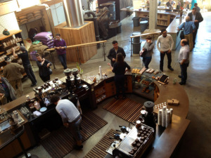
In thinking about the importance of how space was set up, both for staff and customers, in design for service - spaces I wrote that one of the components of service is the affordances created in the spaces in which people work, provide service and are served.
I’m not in UX, so I’m not entirely certain how “affordance” is used technically, but I’ll just assume it’s a reasonable derivation of the original term from cog pysch. If you’re at all curious, I’d recommend going to the source and reading J. J. Gibson’s The Ecological Approach to Visual Perception. It’s a good book.
//Side note: if you’re curious at all about anything, get as close to first sources [like reading declassified excerpts of Boyd’s work instead of the hundreds of faulty third- and fourth-hand derivative applications of OODA] as possible—either reading inwards from derivations or outwards from original sources. It’s better for our brains and better for the world when we know what the **** we’re talking about before words come out of our faces.
As a way to explain affordances, I’m going to use the near-perfect design of my 11 year old, no longer made Spire messenger bag.
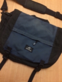
Start with the front of the bag. There’s a zippered outside compartment where we can store whatever. It’s good for things we might want without opening the bag, that’re ephemeral in possession, that aren’t valuable—like a newspaper.

Now look up to the handle. There’s a handle. Because sometimes we’ll just pick the damn thing up without slinging it over a shoulder.

To the left, where the strap attaches, a hook. If we happen to favor one shoulder, we’ll flip the strap easily. [By the way, that original hardware has stood up to severe abuse over a decade through many travels across a dozen countries.]

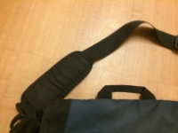


On the strap, a pad that floats. The strap, the whole bag, can move while the shoulder pad stays put on a shoulder. This means that the bag can be pulled to the front of the body or pushed to the back without repositioning the strap. Good for when we’re rushing through airports and crowded town squares. The strap itself is thick, sturdy, wide enough to not dig into skin when the bag is heavy [the way seatbelt straps do]. With an unfancy [no seatbelt buckle, ratchet, or plastic latch here] adjustment mechanism that simply works and is simply easy to use standing or on the go.

Back down to the bag. Two buckles. We’ll loosen them when we’re holding more and tighten them to keep things tucked in when there’s less. Unbuckle one and notice there’s no velcro holding the flap down. For an actual bike messenger, I can see why velcro would be useful to prevent the flap from, well, flappingand being a literal drag. For the rest of us, having velcro here is baffling—two fastening systems to keep the same part down, but the velcro preventing us from reaching in to the bag when it’s buckled to get something out while on the move. But that’s very much the convention with today’s popular bags.

Under the flap, a zippered mesh pocket to see in to. Quick access, good for keeping smaller objects that we might need to see. And above that a pull to change the size of the opening of the main compartment. Hold more, hold less, always secure.


Inside the main compartment, four front pockets. Bigger ones closer to the front outside. Smaller ones below with mesh. Obvious places for writing implements, notepad, phone, water bottle etc. [I bought this bag many years before owning a mobile, so don’t be surprised that there aren’t mobile or tablet specific pockets.]

Another compartment inside the main compartment. For laptops, or whatever. The bag came with a sleeve that was kept in via that velcro strip. But note that it wasn’t built in. So we could take it out. Replace it with a different one when tech changes. Or not use it and just have a larger main compartment. An option that provides function but doesn’t saddle us with something that has an inherently short useful life. Which might not look intentional, but notice the pull that can change the size of the opening and secure it. That wouldn’t be necessary if it was designed for a fixed single use of a particular laptop sleeve size and configuration.
Each of these design elements give us function, not take it away. They afford us ways of using the object which don’t collide with each other. The net experience is one of leverage, value from the very act of using the thing, and never having the design prevent us from getting value.
--
These ideas can’t be new. The thinking is rough, but it serves.
Aneel's razor for design-- Do not create affordances beyond necessity.
- First corollary: Do not create affordances that countervail natural patterns of use.
- Second corollary: Do not create affordances that countervail conventional patterns of use.
- Third corollary: Any affordance that does countervail natural or conventional patterns of use will create a cognitive barrier that must be overcome through
- Education
- Some bridging, stepwise path to transitioning to the new pattern from the old
- Psychological support during the process of achieving competence at, and habituating of, the new pattern